Here begins the “messy process log” entry for the Press Here broadside project!
Basic project requirements:
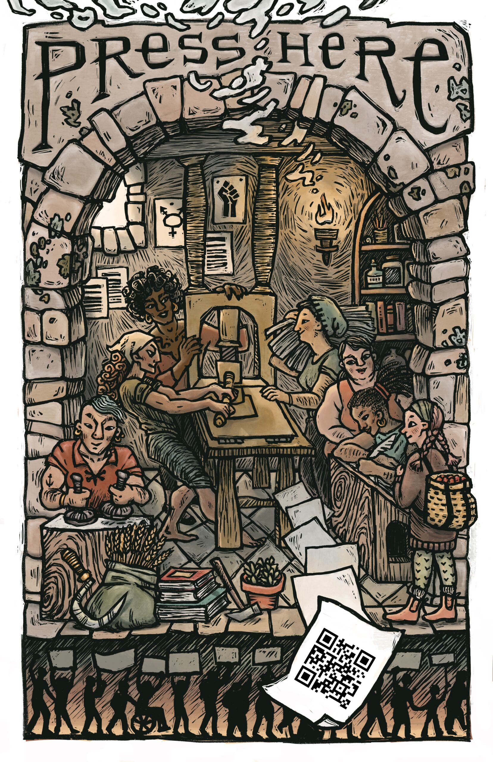
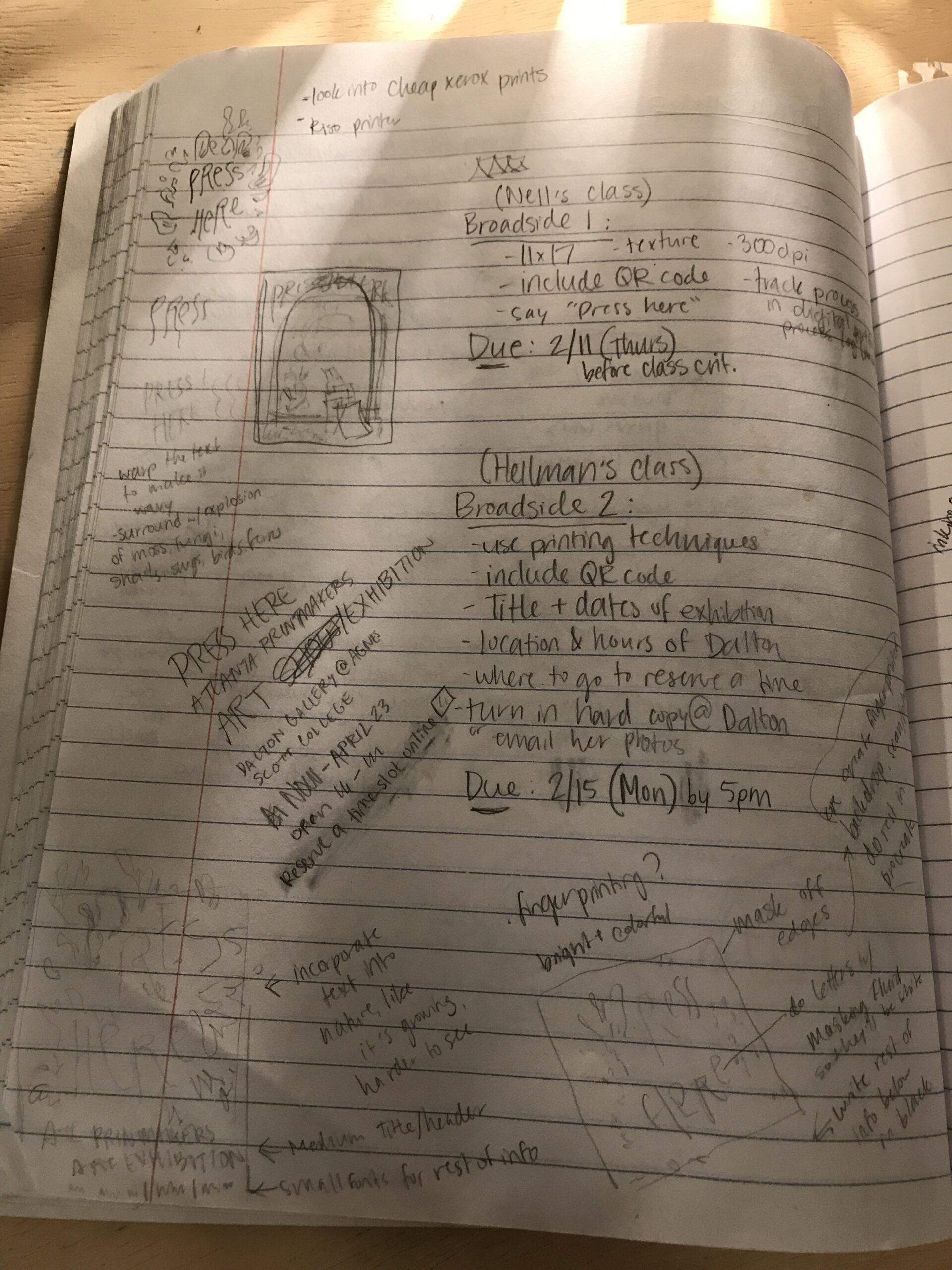
- Create a broadside design to promote the Dalton Gallery art exhibition “Press Here: Atlanta Printmakers Process 2020”
- Dimensions to be 11×17″ at 300 dpi
- Image should incorporate a functional QR code for the Press Here exhibition
- Finished design should represent the feeling of texture and tactility
- Optional: may include the phrase “Press Here”
Our class began a collective brainstorming process by looking through a collection of broadside images assembled by our professor, Nell Ruby, and learning about the history and purpose of broadside designs. We discussed the central themes of
Here is a link to Professor Ruby’s slideshow about broadsides:
Here is some information about the Press Here exhibition:
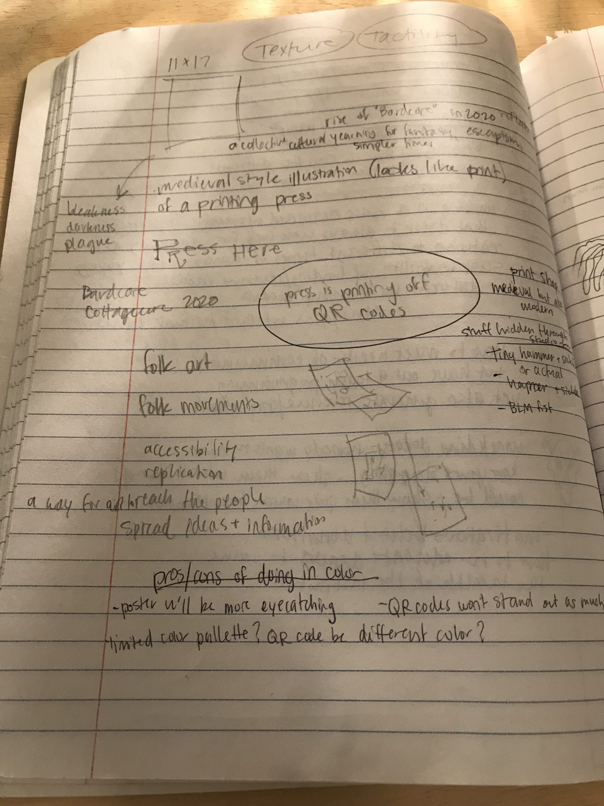
I began my own process by doing some conceptual brainstorming. These are some of the questions I asked myself during this part of the project:
- What are some of the socio-cultural and historical significances of printmaking as a medium? How can I communicate these in my design?
- What themes from 2020 do I want to express in this design? How will I go about this?
- What could the phrase “Press Here” be interpreted to mean? What meaning(s) do I want to incorporate into this project?
- What feelings/impressions do I want the Broadside to leave on people who might see it on the street and not know what it’s about? How can I make it appealing and intriguing enough for them to investigate it further?
- What types of symbols, motifs, objects, and people do I want to represent?
- How will I treat text? How will I treat the QR code?
(Note: more specific writings on my concepts can be found in the Press Here broadside end post on my main page. I will insert the URL here when it is published.)
I arrived at clear focus on my conceptual intentions mostly through discussing my ideas verbally with my class and with my partner at home. After deciding on my main concepts, I thought about what sort of aesthetic I would want to utilize in order to embody my ideas. Here are some key words I settled on after doing a lot of research and brainstorming:
- Playful, fun
- Illustrative, storybook-like
- Appealing, inviting, warm
- Folk art reminiscent
- Rustic; emphasis on the hand of the artist
- “Printerly”
- Accessible
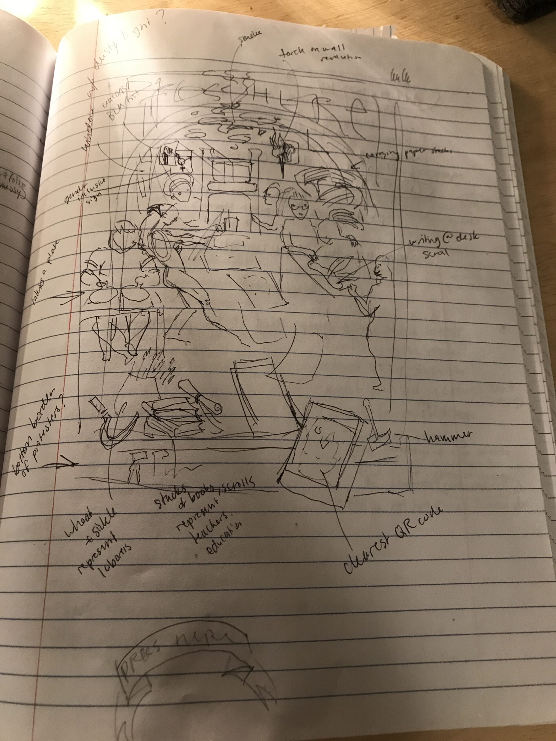
Here are some of my initial notes and ideas from when the broadside project was first introduced.
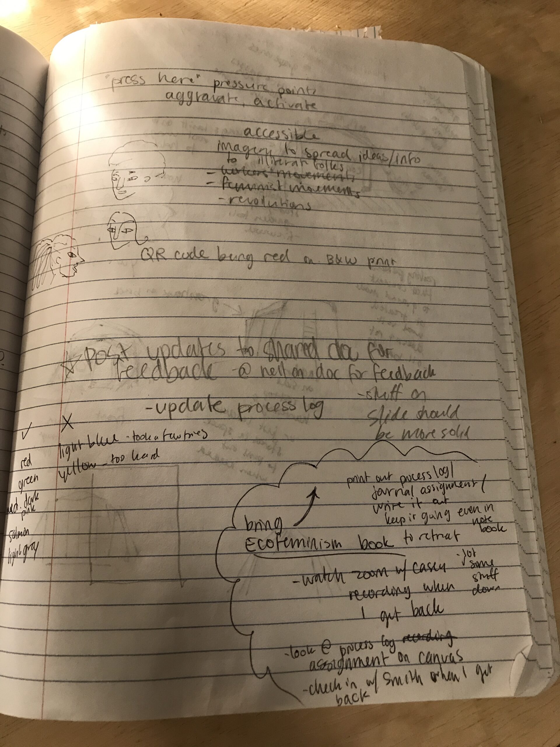
One of the most influential parts of my process was image-based research. I used Pinterest as an organization tool to catalogue artwork which had elements I was interested in (textures, line quality, detailing, printmaking techniques, rendering styles, themes, content, color schemes, etc.).
Below is the link to my Pinterest collection of over 80 images which I used as research/inspiration (I recommend scrolling through to get a feel for the types of images that informed my project).
https://www.pinterest.com/elizacrofts/broadside/
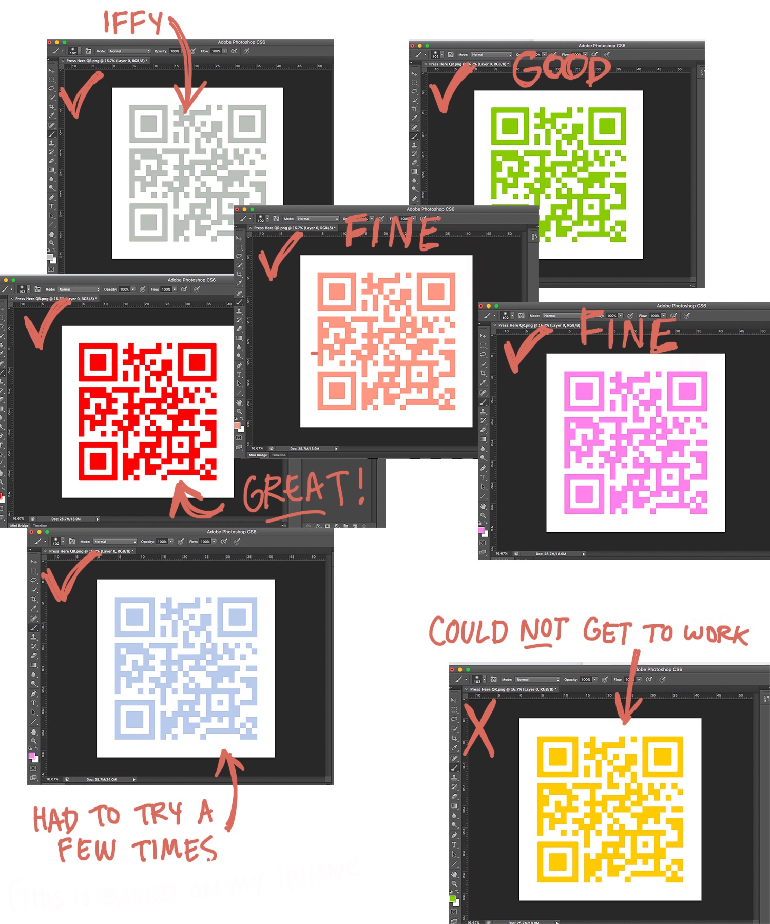
Early on, I envisioned my broadside design being printed in black and white with the QR code being in color to help it stand out. I eventually decided to use a somewhat limited, yet rich color palette throughout the design and leave the QR core in black and white. But before I made this decision, I did a few color changing tests in Photoshop to see what levels of value contrast are necessary to achieve a functional QR code. I shared my findings with my classmates to assist in their own exploration.
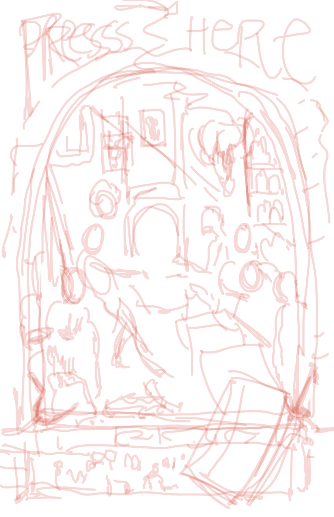
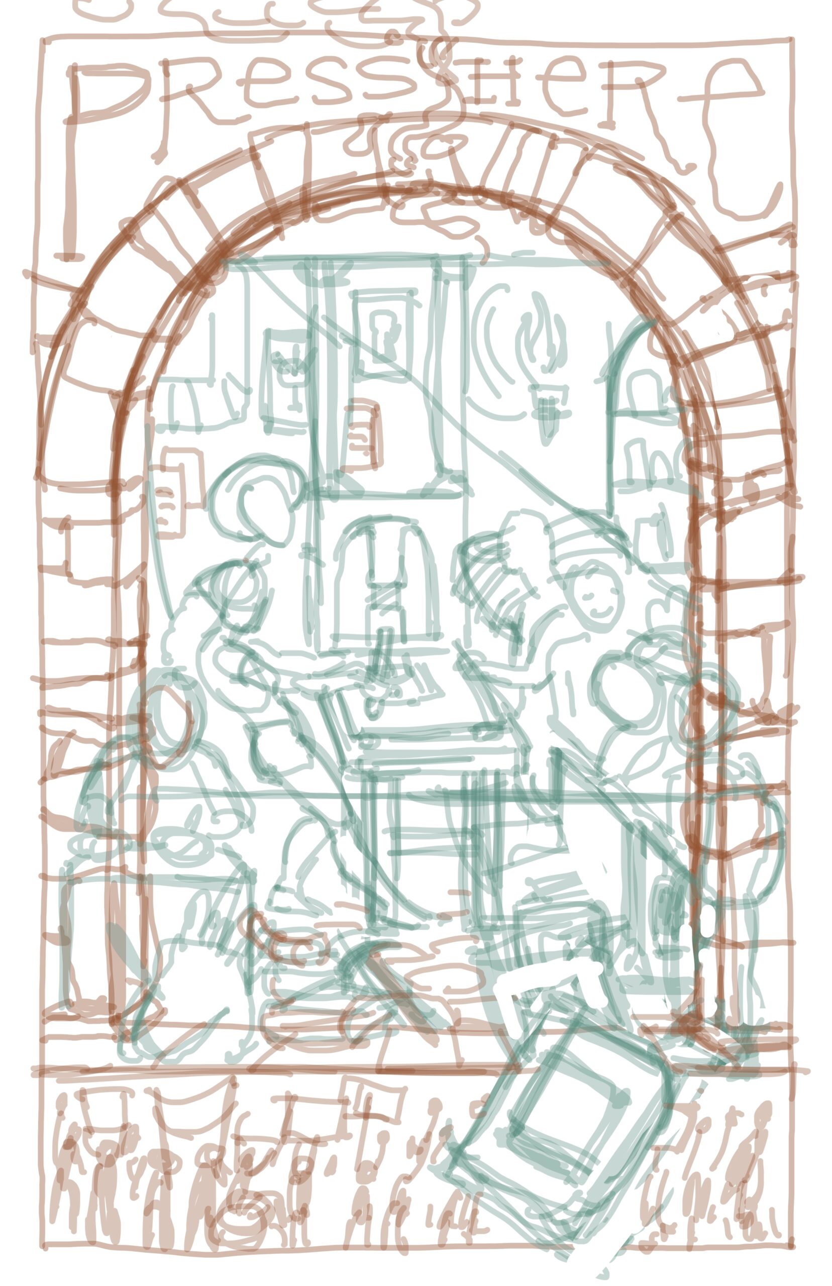
Below are the two initial sketches I drew in Procreate to act as the foundation for my image, building upon the initial thumbnails I made earlier in my notebook. I tried to focus on forms and composition, but at the same time stay loose and work intuitively, not thinking too hard about making it perfect.
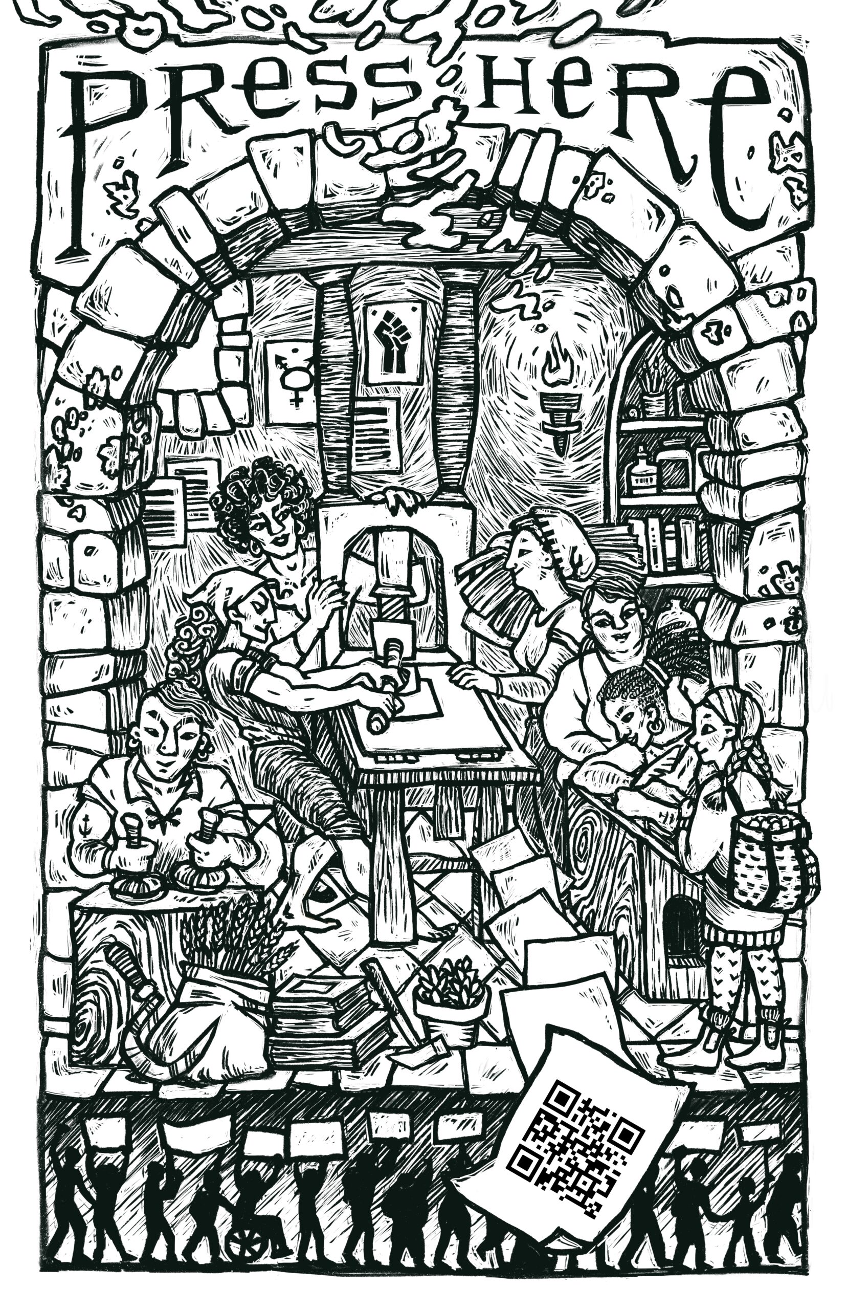
After completing the rough sketch as the base layer, I started building new layers with linework. Below is what the final linework layer looks like with the underlying sketches removed.
After completing most of the linework, I started adding more layers with flat washes of basic color. Again, at this stage, I was working more intuitively, knowing that I would return to refine everything later.
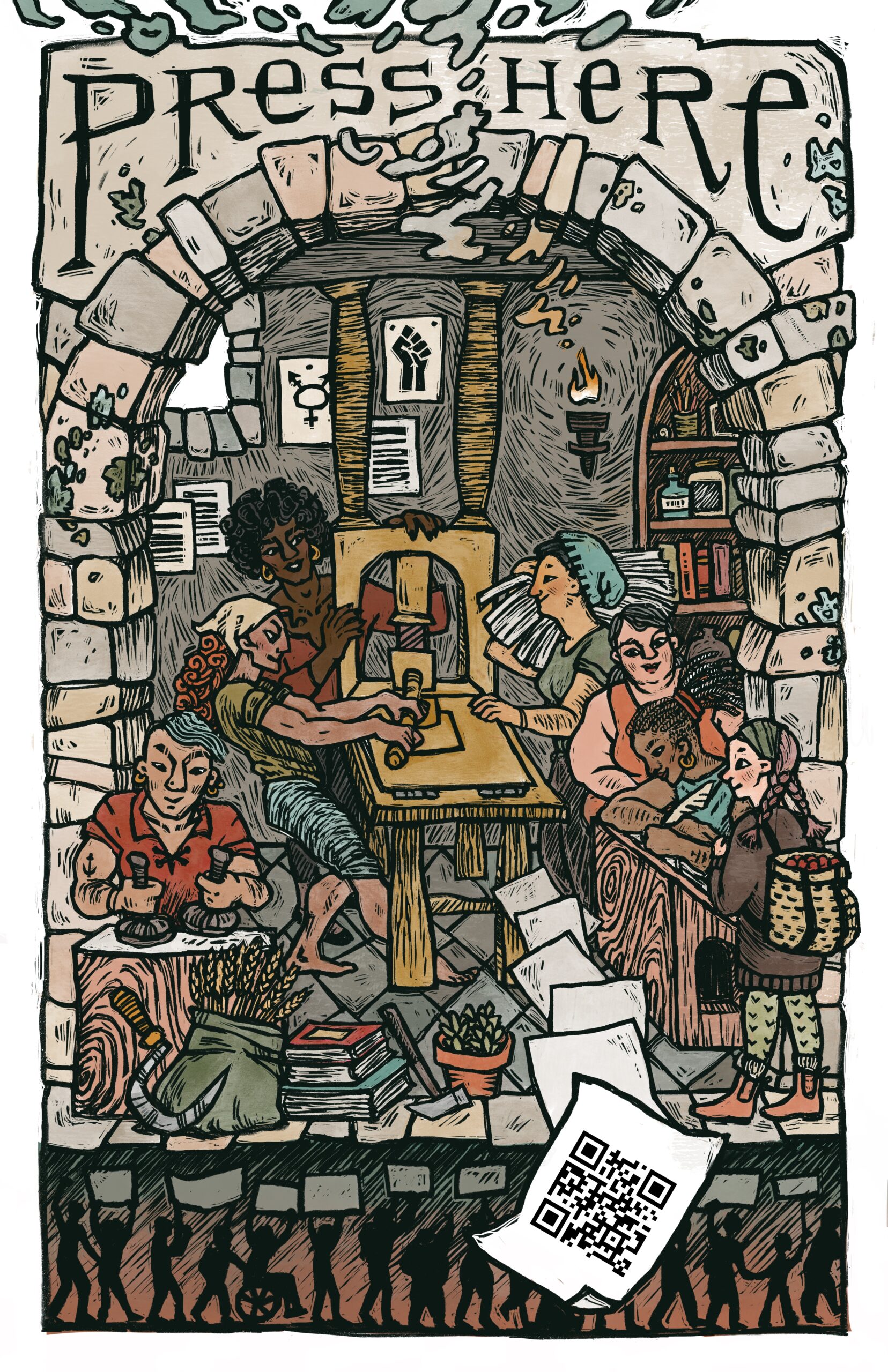
After I laid in the basic color scheme, I created more layers to fine-tune the lighting and shadows to create depth and tonal subtleties. I tried to make the scene feel inviting and lifelike through the use of soft, warm lighting and a more cohesive color palette. This stage was the one that took the most time and was the most challenging, but it was also the most satisfying to complete.
During this phase of the project, I went through a period where I felt conflicted about adding details like dimensional shadows, reflections, backlighting, and other types of surface illuminations because I felt like the overall effect was departing from my original “rustic-looking” goal. The colors began looking more obviously digitally-rendered rather than like they were made using traditional printmaking techniques. But I decided on a happy medium that looks like maybe it could be hand-colored, perhaps using a blend of watercolors and chalk pastels. Of course, a discerning eye can tell it was created digitally; but that’s okay because I am not trying to deceive anyone with how it was made. My intention was to capture the feeling of the artist’s hand being present, and I believe that it is there. I made sure to leave a lot of textural marks, color smudges, and other “imperfections” to embrace that handmade feel. Below is the final result.